Identity system / 2027
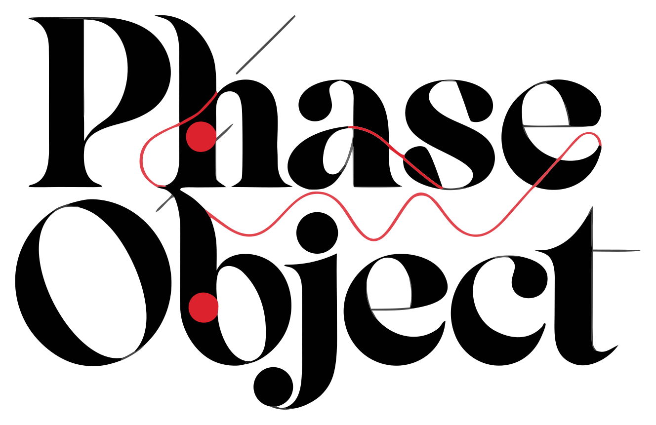
PHASE OBJECT / 01
Use the complete logo wherever the festival name must be identified. Preserve the original proportions and the relationship between the black wordmark, red nodes and signal line.
Maintain clear space equal to one red-node diameter on every side. The dashed frame illustrates the minimum—not a container.
Digital: 180 px wide. Print: 45 mm wide. Below this size, use a simplified wordmark or the two-node motion cue.
Carbon, Paper and Signal Red form the permanent identity. Phase Blue and Voltage are campaign accents—use one at a time. Mist supports schedules, captions and quiet informational surfaces.
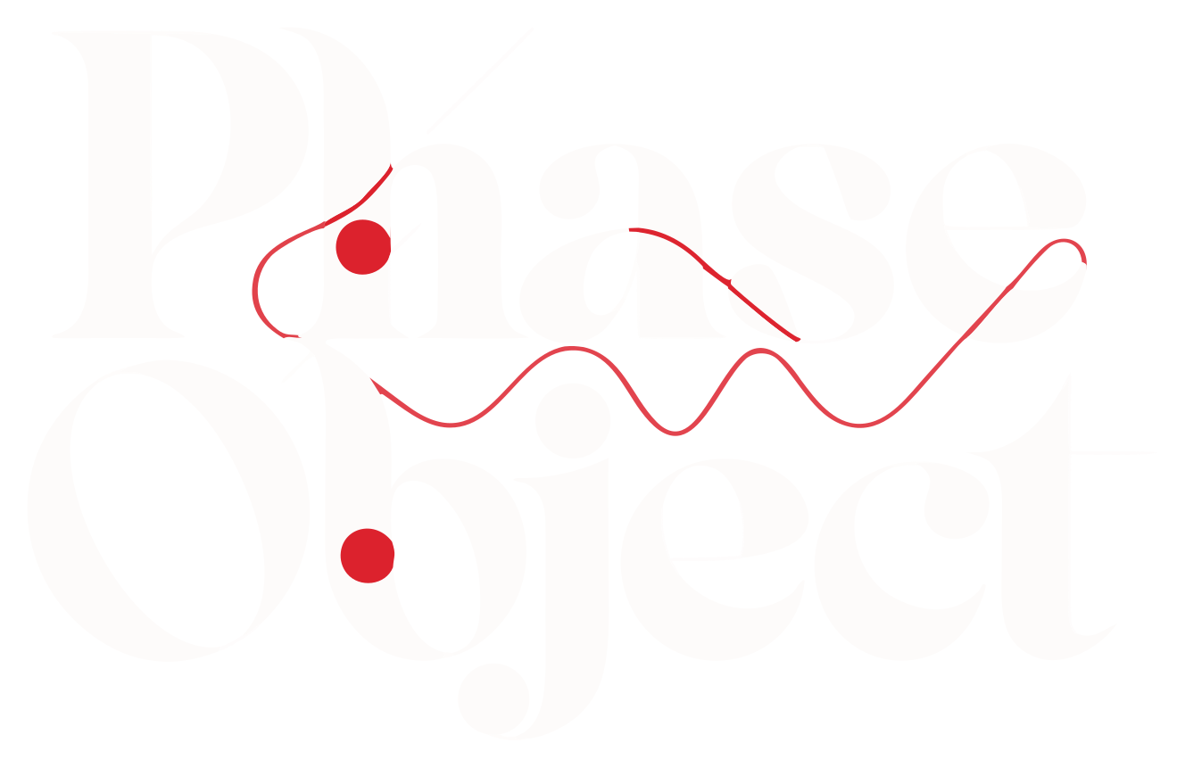
A fine red path can travel through typography, imagery and motion. It suggests transmission without becoming a generic waveform.
Red circles act as anchors, points of contact and motion origins. Use sparingly: one or two per composition.
Duplicate, offset, crop or partially reveal forms. Changes should feel controlled and optical—not glitchy or destructive.
Favor human-scale moments, directional light, tactile spaces and visible creative practice. Avoid stock-tech clichés and empty futurism.